


How many Africas exist? 💰
What Machine Learning can tell us about the uneven advancement of financial inclusion in the continent 🌍


What’s up friends, curious folks, Web 2.0 zappers & African Renaissance witnesses 😎
Today I’ve cooked a nice recipe for you 👨🏽🍳: its main ingredient? Machine Learning.
Its second & most important ingredient? Financial inclusion.
Why bother?
The continent has long been famous for being home to one of the largest unbanked populations in the world 🥶
And academic research (& common wisdom) has demonstrated multiple times how having people & businesses with access to financial services (like payments, saving money, getting a loan, or insurance) is very good for economic development 📈
Hence the formula:
African Renaissance = f(financial inclusion) + e
Good news is that over the last 15 years, there has been a steep rise in access to financial services in the continent - mostly driven by telcos & mobile money technology - so much so that many of them have become household names: in Ghana you “MoMo” people, you don’t “send them money with your mobile money account”.
Fintechs have entered the space too, becoming staples of core services if you think of remittances (Sendwave, Chipper Cash), digital payments (Paystack, Flutterwave) & banking & loans (OPay, Djamo, Carbon).
However, these developments have likely occurred at different speeds in different regions: Africa is not a country!
Opening a bank account in Ethiopia won’t feel the same as doing it in South Africa.
So the question is:
How many Africas exist when it comes to financial inclusion?
More precisely, we will try to answer the following questions:
Is there a “scientific” way to group African countries according to their financial inclusion performance?
If yes, what can we learn about it?
To my knowledge, this work has never been done before, so I volunteer for the gig ✌🏽
Gimmie the data 📊🤩
To start with: what data do we have about financial inclusion in Africa? We need data that is complete, recent, & covering (almost) all African countries.
It turns out that the World Bank‘s Global Findex Database is exactly what we are looking for.
Not only do they brand themselves as the “definitive source of data on global access to financial services”, but they deliver on their flex too apparently.
The 2021 edition is a survey of 128,000 adults in 123 economies.
The number of questions? Over 1,000 🤯
It is a massive database!
Every variable in the questionnaire is reported as “the percentage of the population that”:
Have a financial institution account (% age 15+)
Owns a credit card (% age 15+)
Use a mobile money account two or more times a month (% age 15+)
Made or received a digital payment (% age 15+)
Sent domestic remittances (% age 15+)
Paid school fees (% age 15+)
These are just some examples. As you can see, a lot of interesting stuff. Let’s get to work.
Know your neighbor: clustering with K-Means 💫
Disclaimer: all the work is publicly auditable at the GitHub repo I’ve created for this task. I won’t share too many details on the methodology but have a look at it if you’re curious.
Once I’ve cleaned a lot of mess in the data, deleted records with too many NULL values (huge problem), and reduced the number of variables (both manual & statistical selection), I am left with decent data on 42 African countries for 141 variables.
How can I group countries according to how similar they are to each other (along all 141 dimensions)? 😱
KNN stands for Key-Nearest-Neigbour. It is a distance-based algorithm.
Imagine having a dataset of students measured along two dimensions (height & weight). K-Means (a form of KNN) will look at the students closer to each other along both dimensions and assign them to a single cluster.

You need to select in advance how many clusters you want to create. For the Global Findex Database, I opted for 5 clusters.
Then, the algorithm randomly selects a center for each cluster (centroid), it calculates the distance of each point to the center, and iterates until it identifies centroids that maximize the distance between clusters and minimize the distance within clusters.
We let the algorithm do its magic 🪄 and …… we got the clusters!
Group 1: South Africa, Botswana, Mauritius, Namibia
Group 2: Kenya, Ghana, Uganda, Gabon, Lesotho, Eswatini
Group 3: Nigeria, Tanzania, Togo, Senegal, Rwanda, Angola, Liberia, Mozambique, Mali, Malawi, Zambia, Côte d’Ivoire, Congo (Brazzaville), Cameroon, Burkina Faso, Benin, Zimbabwe
Group 4: Niger, Mauritania, Sierra Leone, Madagascar, Chad, Comoros, Congo DRC, Guinea, Gambia, Ethiopia
Once again: these countries have been assigned to a Group according to how similar they are to each other, along the 141 dimensions measured by the Global Findex Survey (I had to drop Group 5 because it had too many NULL values).
We can already see/imagine a rank of financial inclusion performance for these Groups. But let’s have a look more in-depth: how different is Group 1 from Group 4 when it comes to access to credit?
Banks vs Telcos: What Mobile Money Did to the Continent 📱
I will now calculate group averages along specific dimensions.
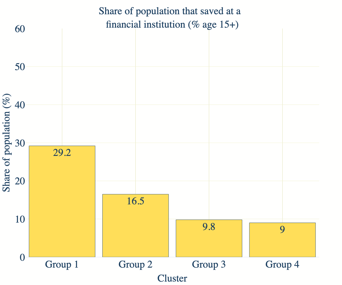
If we look at savings (Figure 1), Group 1 leads the race, having the highest share of the population saving at a financial institution: a good indicator of financial inclusion.
However, things change a bit if we take into account savings using a mobile money account. Group 2 takes the lead. The same can be observed if we look at borrowing activity (Figure 3).


Digital payments, both P2P and online, Groups 1 and 2 are leading, whereas Groups 3 and 4 are following behind (Figure 4 & Figure 5).


To better visualize clusters, let’s take now two random variables and plot them against each other. I’ll take:
Borrowed money from a financial institution or mobile money
Used a mobile phone or the internet to buy online
Although we can’t see a clear-cut distinction between Groups (clusters are made along 141 dimensions, not just these two), we can still see a sharp separation line between Group 1-2 and Group 3-4, and we observe similar behavior along other dimensions too.
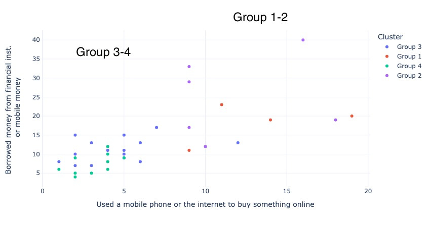
P.S. Variance within clusters varies a lot according to what variable we choose, so I won’t report it.
What can we learn from the data? 🧐
South Africa & Company (Group 1) have better access to formal financial institutions.
However, Ghana, Kenya & Uganda & Co compete on access to services like savings and access to credit, if we take into account mobile money applications.
Now, how well-developed are these applications as of today? Or are people simply using their wallets for multiple purposes in an artisanal way? Can’t say.
Group 3 and Group 4, which comprise most of the countries (from Nigeria to Côte d’Ivoire to Angola etc..), are clearly lagging behind.
We can see that, ultimately, these Groups mimic GDP per capita separation lines. If we compute the GDP per capita average of each group, what do we find?

Financial inclusion performance seems to go hand-in-hand with GDP per capita.
What is interesting is that Group 2 can still match Group 1 in financial inclusion performance thanks to mobile money, although it accounts for half its GDP per capita. This simple experiment shows that companies like M-Pesa & MTN Ghana, coupled with smartphone manufacturers like Transsion, are really driving financial inclusion in those economies where, if we’d look only at GDP per capita, the formal financial sector wouldn't play a role.
Now, how this plays out concretely is something we need to validate in the field. And this is because despite being one of the most comprehensive datasets on financial inclusion, the Global Findex Database poses some problems:
a lot of null and missing values for some African countries;
not all data is recent (for some countries, the most recent data was from 2014 😒);
the type of questions, as well as their wording, doesn’t always allow for matching the responses with factual data.
That’s it, folks. More geeking coming soon & hopefully with more insights down the line! 🏃🏽♂️💨🏃🏽♂️💨🏃🏽♂️💨
Link to the Github repo → https://github.com/y4nnckdez4/knn_global_findex_data